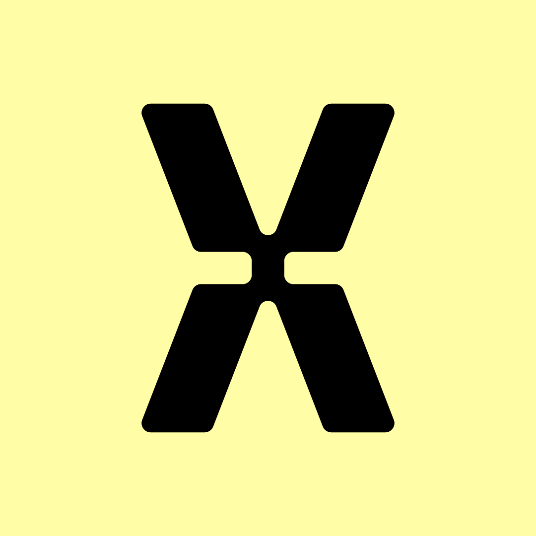
Anagram Design has 'extracted' the X from our project acronym to create a distinctive identity for our team and work.
The bold glyph can be seen as a confrontation between the typographical signs for 'more than' and 'less than', as in the conflict between consumption and resources.
Another reading could interpret it as two sets of arrows pointing in opposite directions (forward/backward; upward/downward).
Signifying the sequential nature of the design process, the transformative trajectories of materials, and the diachronic dimension of historical scholarship, this shape ingeniously captures the key concerns of the project in efficient and beautiful graphic design.
Thank you, Anagram!